Top 10 Design Trends for 2021
A New Year Means New Trends
Graphic design trends are always changing, as people become attracted to specific styles and designs. Graphic design plays a big role in marketing your business, from creating visuals for your website, designing pieces to be shared on social media, or creating a special magazine ad, you can guarantee that if you’re a business, you will be using graphic design at some point. Graphic design optimizes your brand and marketing efforts across numerous channels and is key to being viewed as a professional brand. Every year, we see new graphic design trends pop-up that are popular amongst a variety of audiences, and the same is true for 2021! Let’s look at this year’s top 10 graphic design trends!
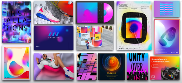
1. Electric Fade
The electric fade design trend is something that has been around for a while but has been recently becoming more mainstream. This trend uses bright, electric colours like magenta, cyan, purple and yellow to create a brightly coloured, flashy visual. These colours are often used in a curvilinear blend to mesh the colours together in a seamless and attractive way. This trend is popular in tech, sportswear, and environment-based ads that are trying to quickly capture the readers attention.
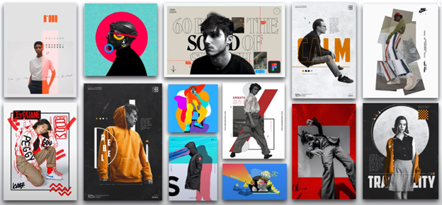
2. Figure Isolation
Another trend we are seeing become more prominent, especially in sports, music and fashion is figure isolation. This design style uses isolates human figures out of a busy background and places the figure over something less dramatic or a digitally designed background. By placing the figure on a more open, blank background there is a cohesiveness between the two layers then blend together to create a strong focal point. This method also allows other graphic elements like text and shapes to be added more easily since they are being placed on a blank background, and the figure itself acts as an anchor point for these other elements.
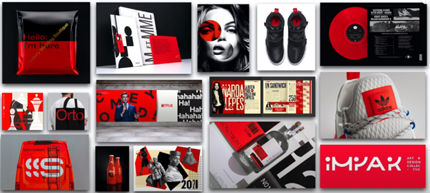
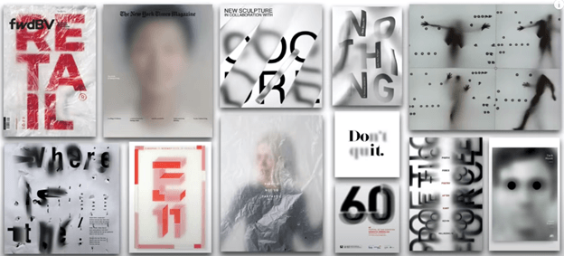
3. Redline
Our next trend is focused on the use of colour, specifically red, white and black. This trend, known as “redline” focuses on these 3 strong, and attractively pairing colours to create striking graphics. The brightness of the red is an instant attention grabber, while the black and white provide relief for the eye. When these three are paired together, they create a hard to ignore palette that invokes emotion but is still appealing to the eye. This style is seen most often in outdoor advertising, activewear and retail. The colour red is highly connected to sales and promotions, for its ability to enhance physical reaction. When we see red, we are programmed to think “danger” which is why the colour red often grabs our attention most. Be prepared to see this trend take off throughout 2021!
See how we used this design trend to build an amazing website for one of our clients!
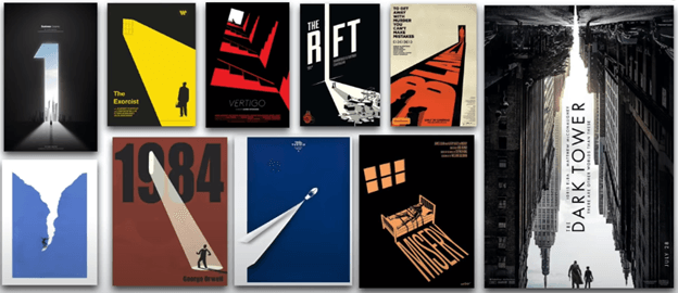
4. Sliver of Light
The next design trend for 2021 is a “sliver of light”. This design trend often uses a dark coloured background with a ray of light colour leading the eye or revealing the main message of the piece. The same effect can be accomplished by reversing the colour schemes, with a light-coloured background and dark sliver to lead the eye. It depends on the mood your image is trying to convey. This design technique is primarily used where illustrations and text layouts draw the eye to the primary story of the design by acting as a visual pathway. This design style is often used in movie posters and illustrations to add a sense of drama and mystery, where the primary focal point is often a human figure.
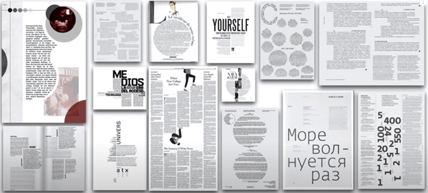
5. Architext
The architext design trend is perfect for magazine spreads and advertorials that have heavy amounts of text. Unlike other design trends that focus on imagery for the main appeal, architext uses the large amounts of text to build the structure of the design. Most often, this design trend uses a blank white background to optimize the reading ability of the design. The text is then structured in geometrical shapes and designs that attract the readers attention. These specially shaped text blocks can be paired with illustrations and imagery to build additional layers to the design and add further visual appeal. Headers and subheaders can be added in a variety of styles to help guide the eye through the design and lead the reader to the most important pieces of information. With this trend, legibility doesn’t always have a high amount of importance, rather the text adds a visual element for the reader to focus on.
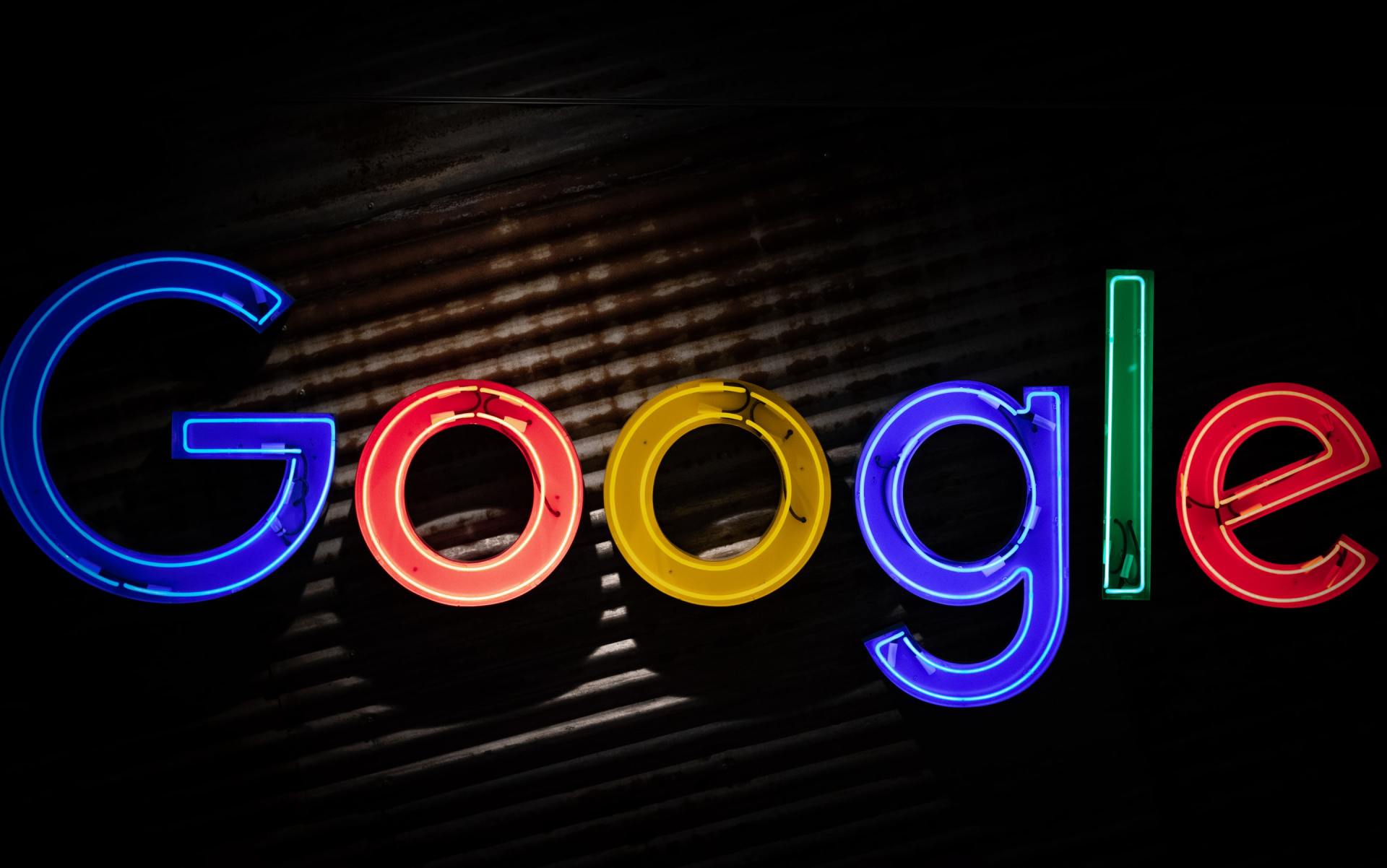
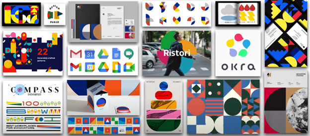
6. Bright Geometry
The bright geometry trend we have seen become popularized by large companies like Google, more specifically their tools like Gmail, Drive and Calendar. This trend uses brightly coloured shapes, primarily blocks and circles to build the foundation and appeal of the design. The colour palette is more subdued compared to that of the “Electric fade” trend, using more regular blue, yellow and red colours. This trend is popular amongst tech and web companies who create appealing icons and logos using this design style but can also be paired with photography to create interesting ads and designs when done correctly.
7. Blurred Imagery
Exactly how it sounds, the “Blurred Imagery” design trend uses blurred photography to create visual contrast against text and other layers of the design. Most popular in video media, signage and editorial prints. It is popular when using imagery of people and large text to add some visual interest into the design. The blurriness of the image brings a level of mystery and interest while adding a sense of movement and depth to a otherwise static image. While we often see this trend using darker and flat colours like grey and black, using bright colours can add another piece of interest and something to capture the viewers attention.
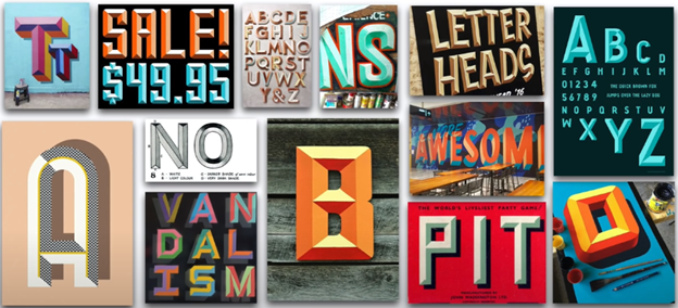
8. Chiseled Typeface
This design trend focuses on the text in the design, adding a 3d look to the typeface. This retro look is being popularized in signage and print advertisements for its ability to draw the readers attention to the text in the design. Unlike other design trends that rely on the imagery to build character and depth, this trend uses the text itself. We are seeing more and more fonts created and utilized for this trend specifically, as the chiseled text brings life and character to something that is often bland and easily overlooked.
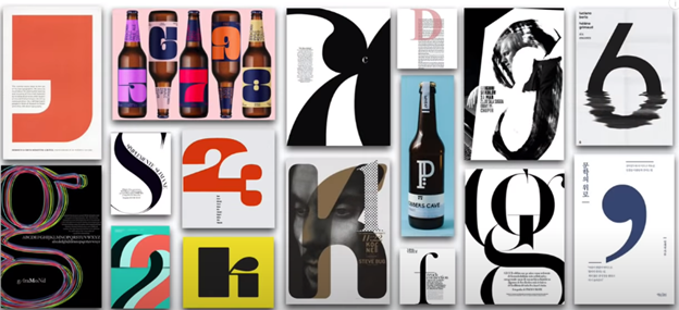
9. Singularity
Our next design trend is called “Singularity”, which is characterized by the use of one, excessively large number or letter to draw the viewers attention. This large text acts as the anchor point for the rest of the design. Other shapes and text can then be built off of the original piece to add depth, contrast and additional visual appeal. By being dramatically cropped, the individual text acts as the abstract element to build other design layers around. From editorial prints, packaging, and promotional posters, this trend will be hard to ignore throughout 2021.
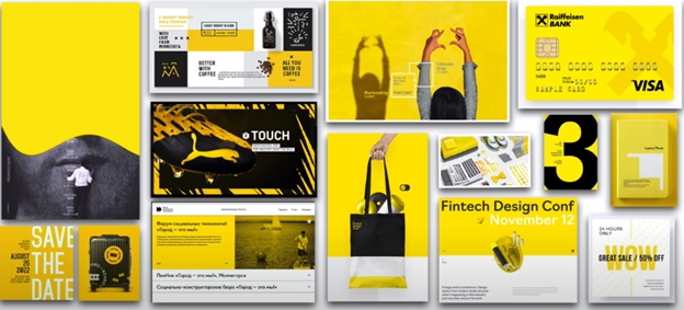
10. The Colour Yellow
Our final design trend to watch out for in 2021 is the colour yellow. Many speculate that this trend stems from the gloominess of the last year, especially involving the COVID-19 pandemic, and that we are optimistic of the bright times ahead. This design trend is already showing up in numerous areas including print advertisements, web design, sports, tourism advertisements and the financial industry! The bright yellow colour adds POP! And immediately captures the viewers attention. By pairing this bright colour with white and black, the contrast is easy to interpret the important information while adding relief for the eye.
Are Your Designs Ready for 2021?
These top 10 design trends are already proving to be popular and effective in the first few months of 2021. With a variety of applications and designs, there is sure to be something that your business can use to add an additional layer of appeal to your designs while using these trends to your advantage!
If your ready to set your business apart and add some visual appeal to your digital presence, let New Heritage get you started!